the brieFing
The main interlocutor was Gregory Wrobel one of the co-founders of the start-up. What was important for me is to examine the brief document, and it's a big one: more than 50 screens. We checked everything together, made sure for me to understand all the features, ensured the smooth running of the app each time I made a change.
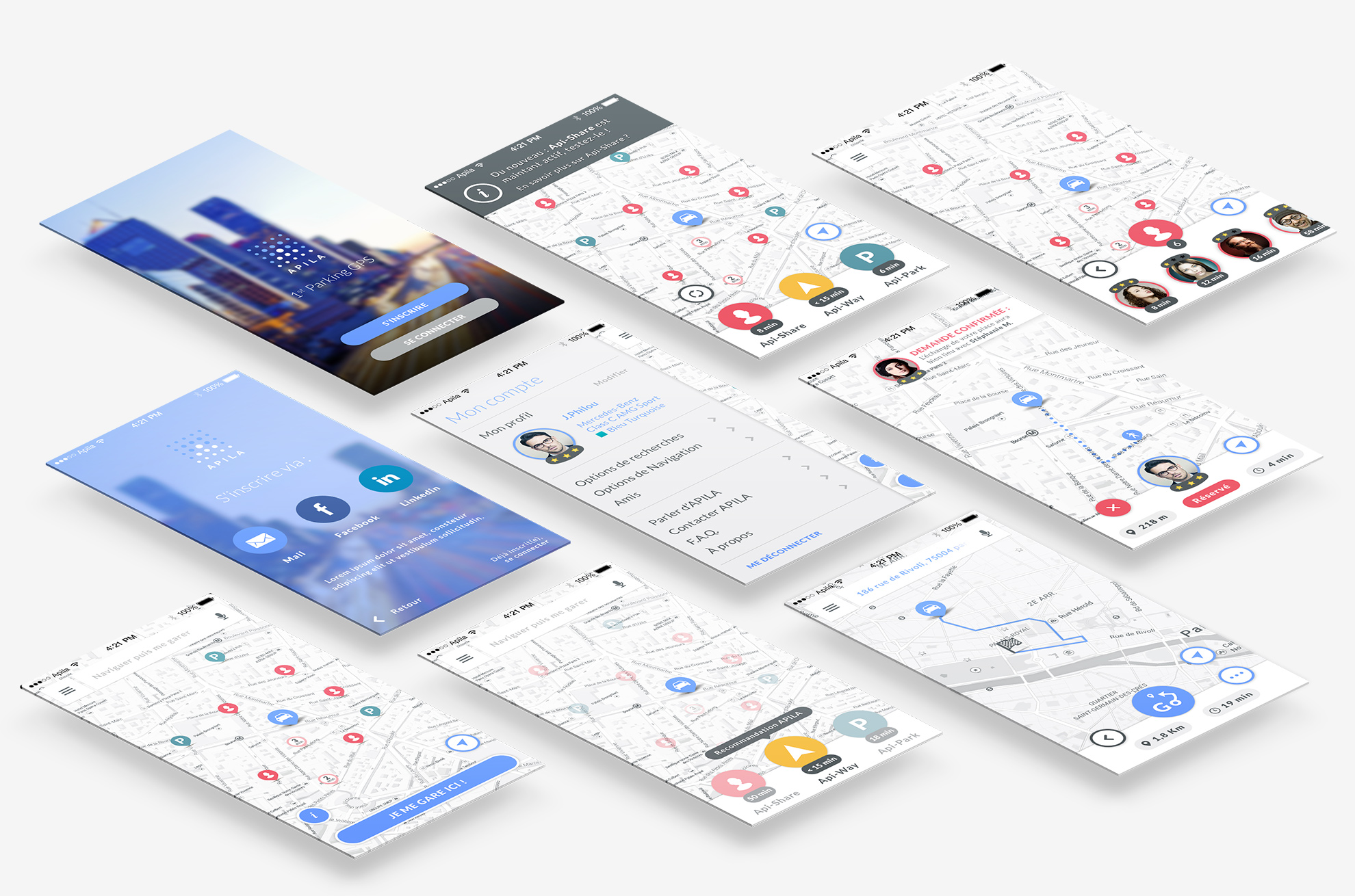
Basically, we had about 4 or 5 different templates to design, here are the main ones : the Home screen and the Navigation screen.
Main Screen or Home Screen
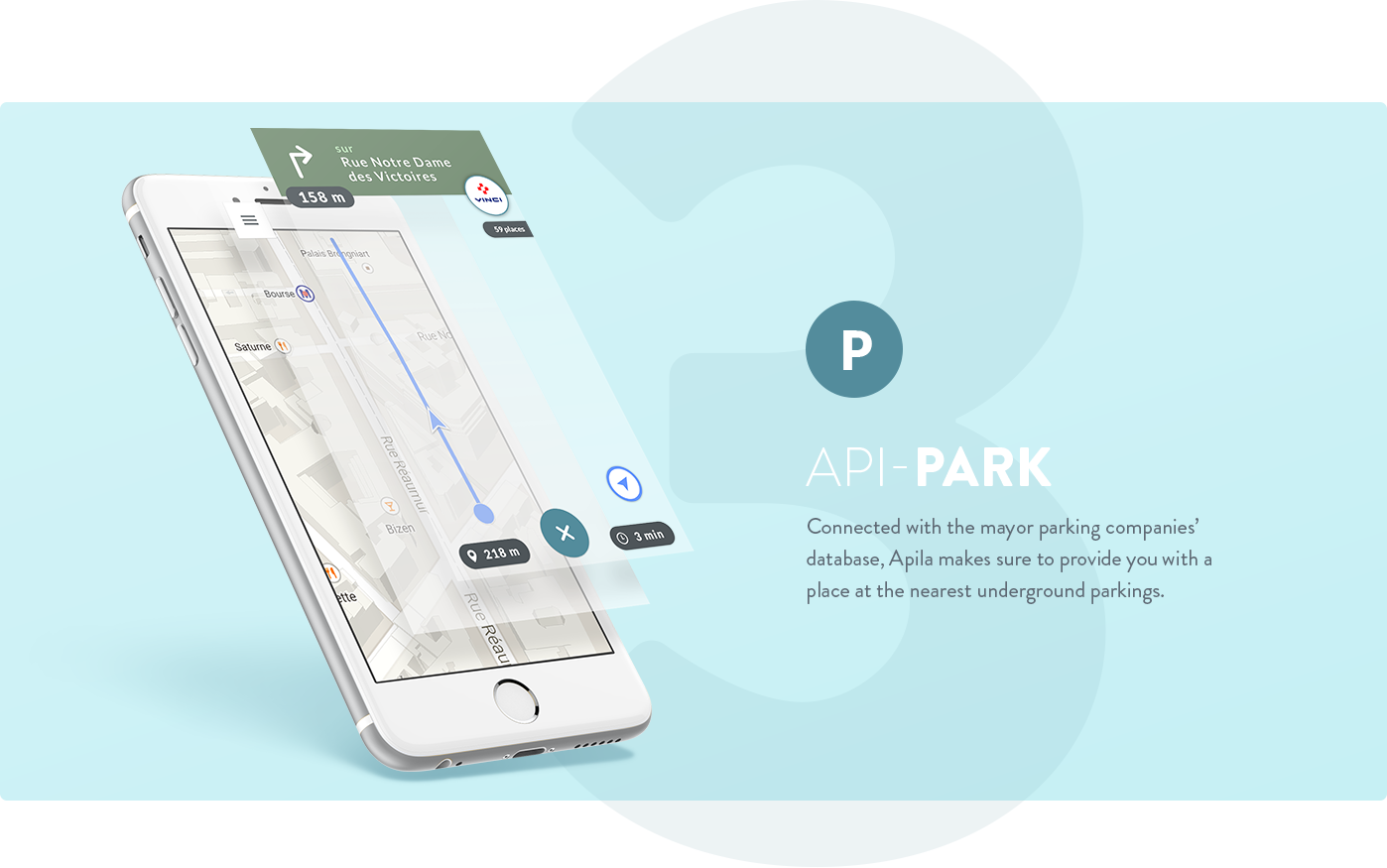
Apila is structured around three main features: API-WAY, API-SHARE and API-PARK. All features should be available at the initiation of the app.
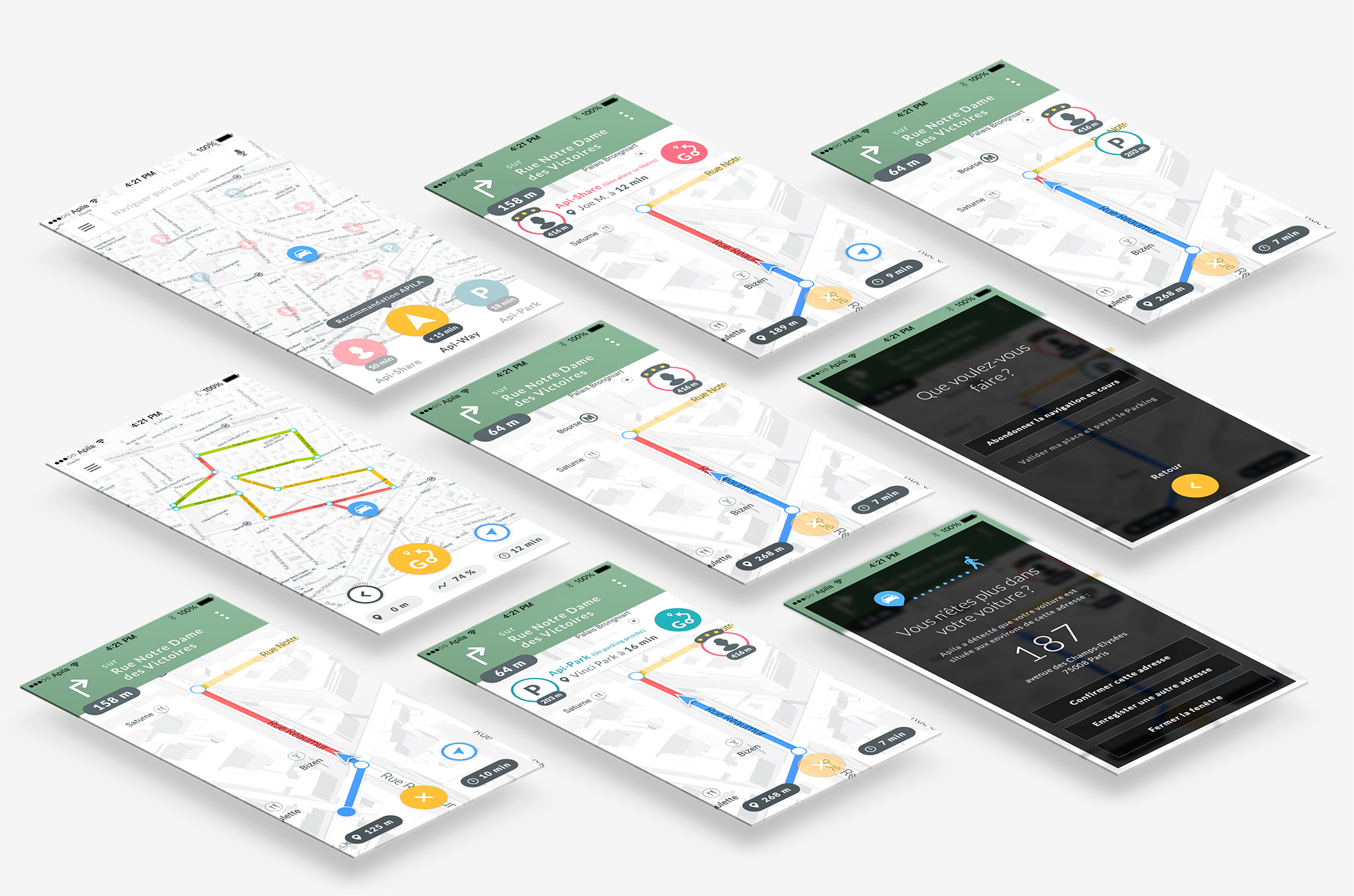
Navigation Screen
The navigation screen should be simplified, it only lets appear features that the user needs throughout his app experience.
UI elements & HOME SCREENS
The importance of the color choice
By using distinctive colors on the UI elements : pink for the Api-SHARE, yellow for the Api-WAY, green for Api-PARK and blue for the user's navigation, we ensured a good usage experience. Also the driver knows at a glance what feature he's using.
To display the chances to find a parking space, we displayed easy reading colors and the car trajectory. Moreover it ensures for the drivers a best focusing on the road.
Apila could find a better suggestion, a notification pops out in the navigation screen. After a moment, it automatically collapses to a minimal version to free the space on the screen.
Apila can detect when you walk away from your car, to differentiate from another alert notification, I designed information screen with a black-ish screen to capture the user's attention.
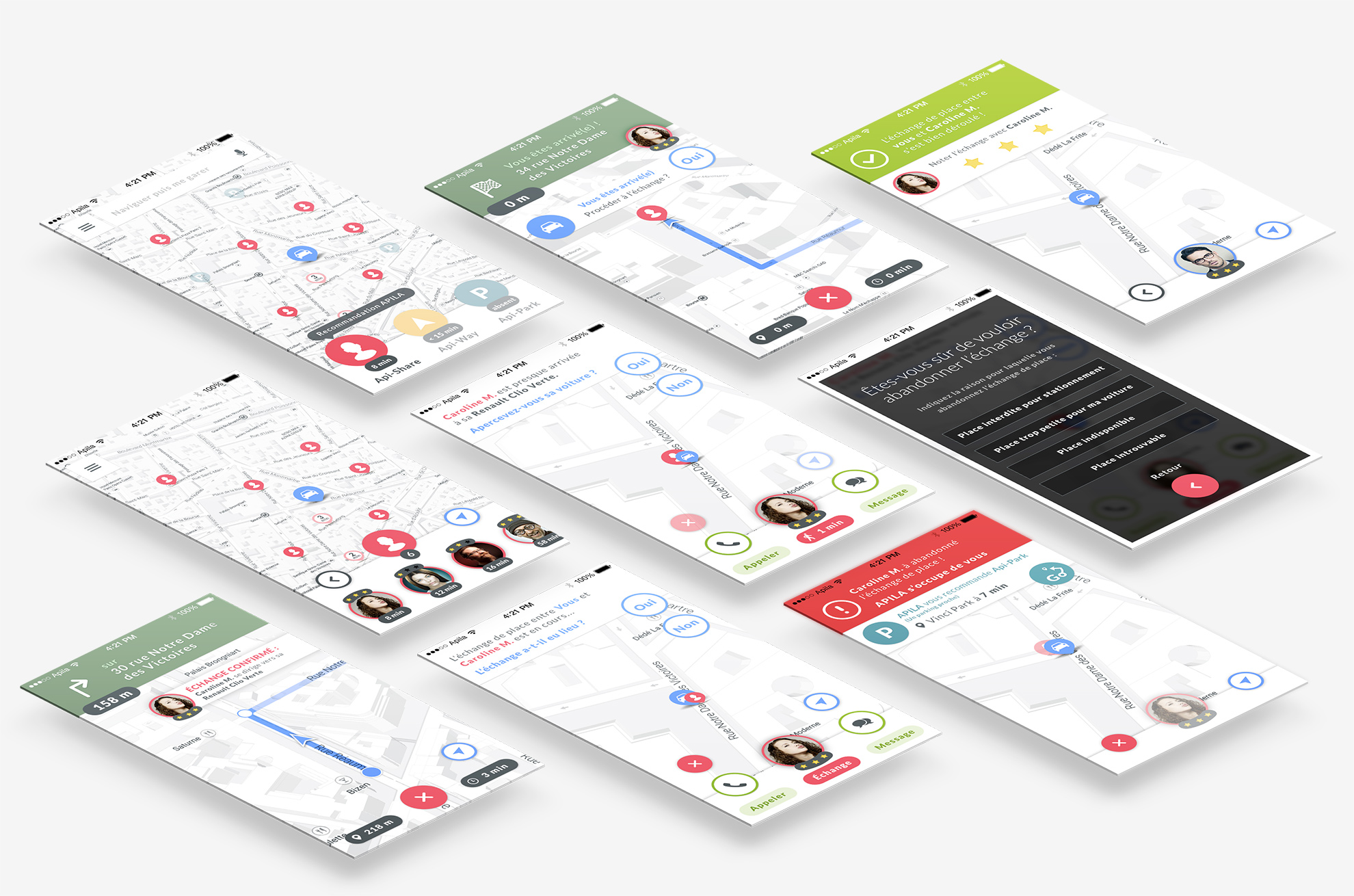
The following screen shows who's about to leave his parking space, how far they are and the people who already left them (time in the pin). Just select the right person and start the sharing experience.
Using the right colors with the same logic ensure a good understanding of the app: bleu for the navigation interactions, green to get contact with other users.
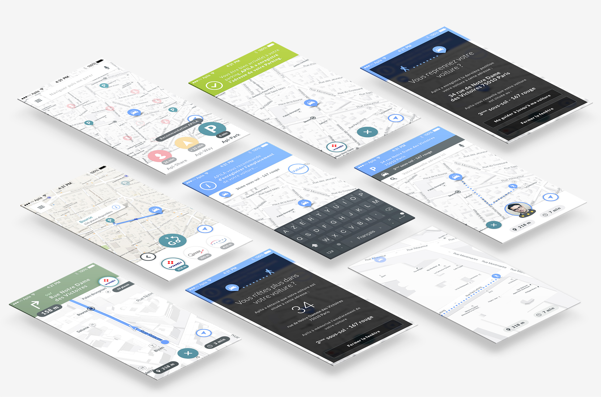
Apila reminds you to save your parking place when you leave your car.
When your restart your , Apila reminds you the parking's address and your car's place...
Final Screens
